In the digital age, where brand identity is paramount, the logo stands as the beacon, the first impression, and often the lasting memory. Let’s shed light on how the world of logo design is about to experience a seismic shift. An example is Ideogram that offers AI assistance in this creative process, ensuring that logos...
Tag: Design
What is a Style Guide and why you need one
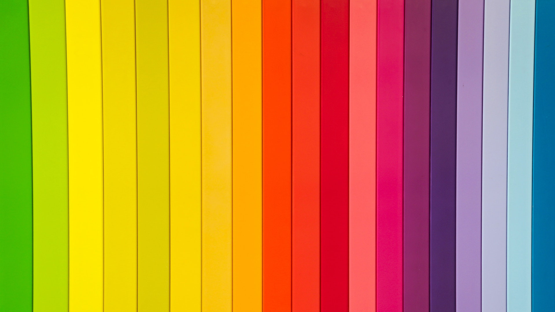
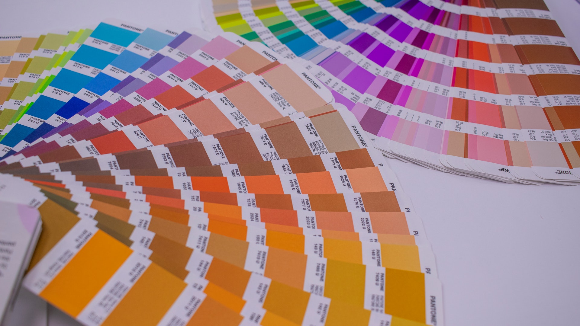
A style guide is a document that outlines how the various elements of your company's design should be used in public. It contains, among others, the logo, colors, and fonts. It also determines where and how these elements should be used. Consistent communcation Communication is key for your company. It must communicate with customers, employees,...
What is user-centered design?
User-centered design is a term used in the software industry to describe designs that focus on the users' needs and experience. The idea is that by understanding users' goals, motivations and needs, designers can create better software that is more enjoyable and easy to use. User-centered design is sometimes also called human-centered design or user...

5 Top Design Feedback Tools for Designers & Developers
The web design process has evolved significantly over the past couple of years. More and more agencies now work with remote clients and team members, which underscores the need to streamline the design feedback process and ensure creative collaboration between the two. The most common issues in the design process include communication barriers when gathering...
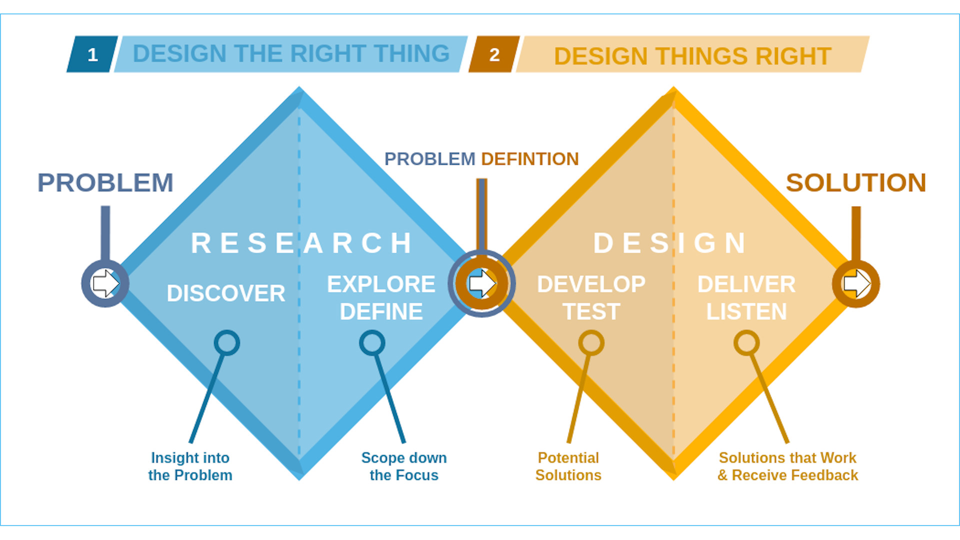
What is the Double Diamond design model?
There are many ways to design. Design is not like other disciplines that have immutable processes. Design is a field that encourages and allows practitioners to adapt and change their methods. As such, the design process could be seen as antifragile: it is similar to a forest strengthened by fire or a muscle that is...
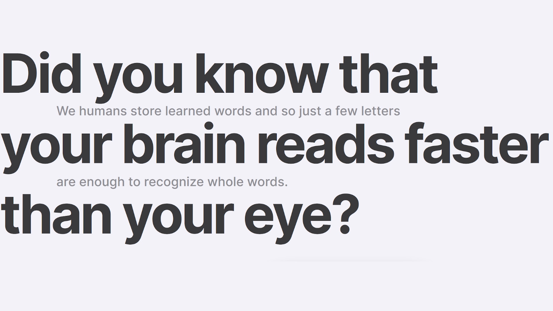
What is Bionic Reading?
Bionic Reading allows users to simplify text and eliminate distractions. The app highlights the most important parts of text and revises them accordingly. This helps to guide the eye through the text and aids in the brain's recall of previously learned words. It does so by guiding the eyes through text with artificial fixation points....

Instagram is testing Full Screen Content
TikTok's signature user interface feature is full screen vertical video. Instagram is currently testing a feature that offers a similar immersive experience and puts video front and center. The subtext is, that Instagram continues its quest to grab our attention away TikTok. Meta, the parent company of Instagram, stated last week in its earnings call...
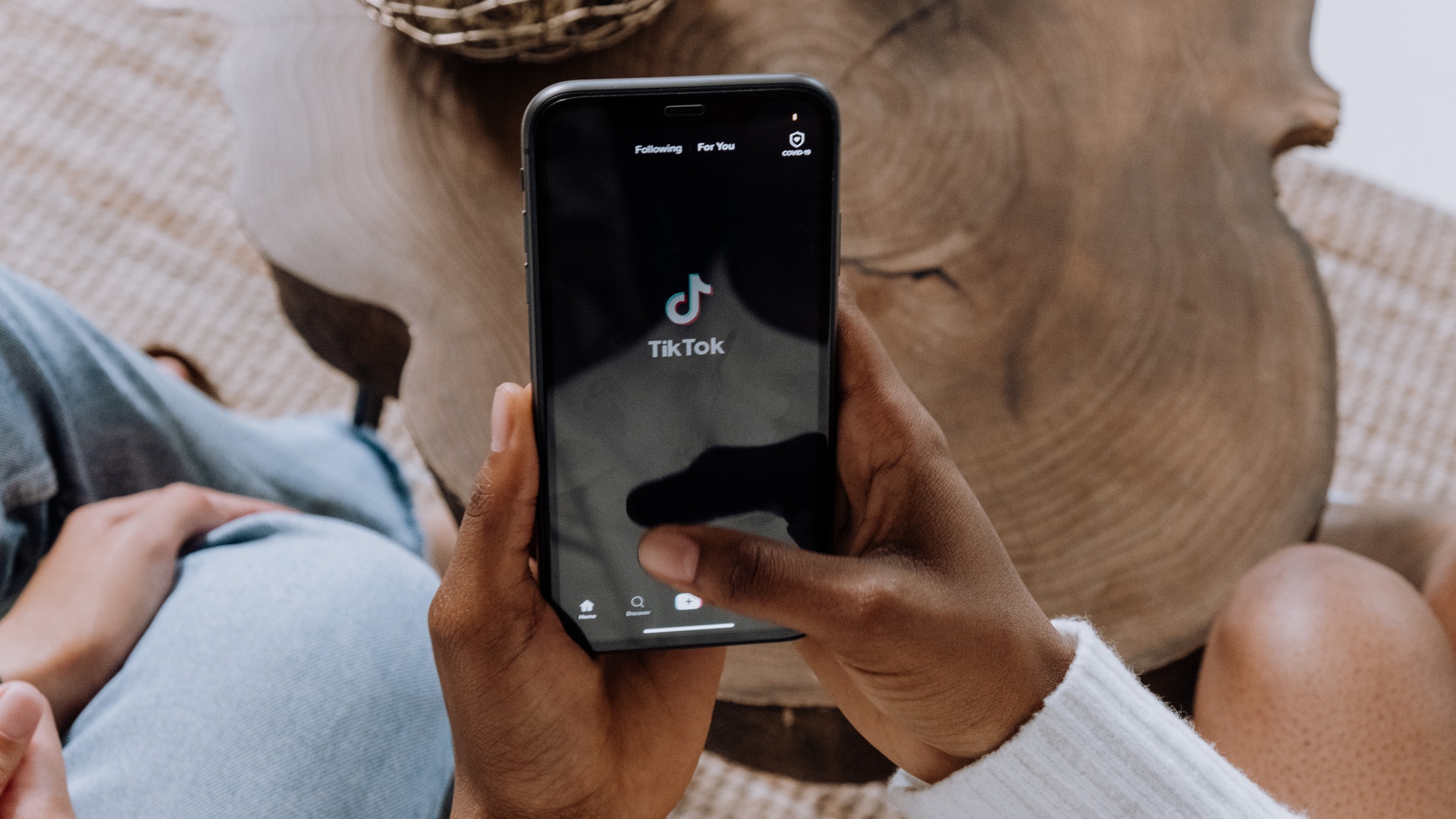
TikTok GUI Design Tricks
TikTok is famous for it's addictive nature, especially with younger users. It uses a few design tricks to keep users engaged. Onboarding - It starts with a Swipe The process of getting hooked to TikTok starts right away in the users onboarding experience. TikTok asks users to choose their interests. This information is used for...
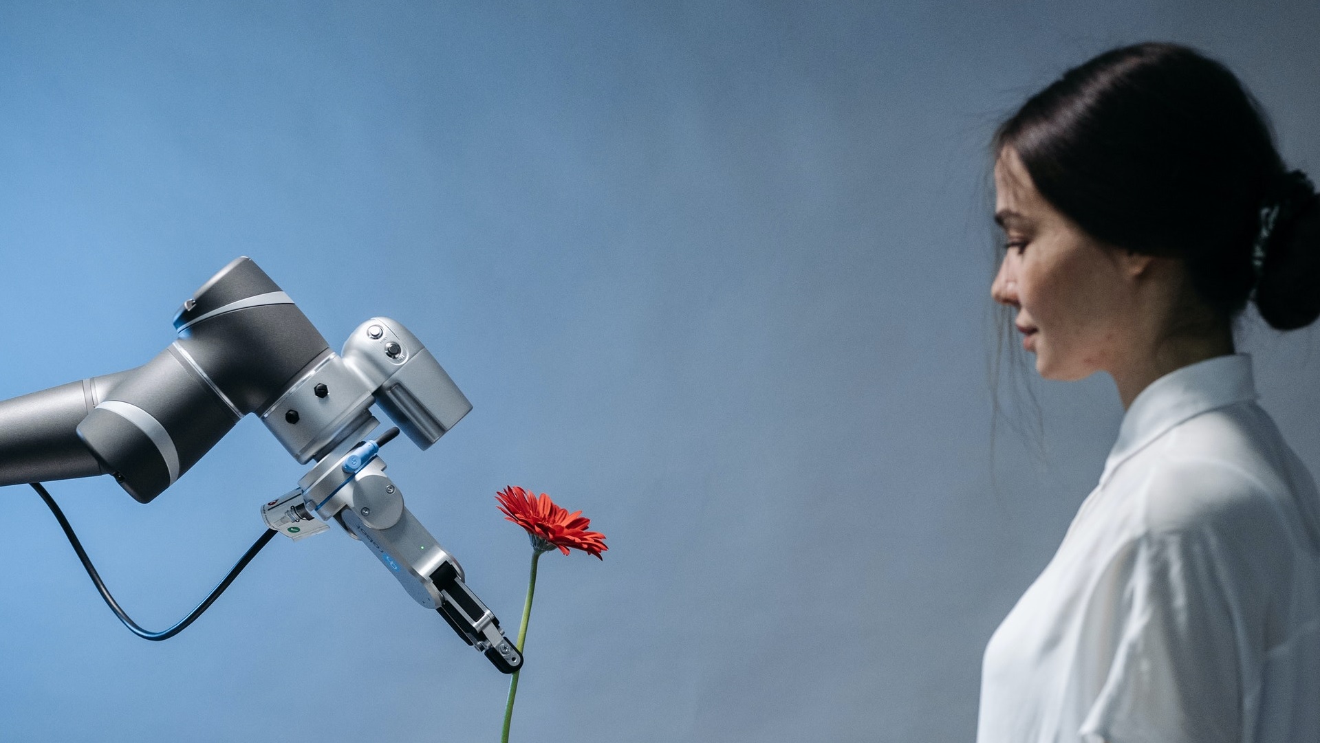
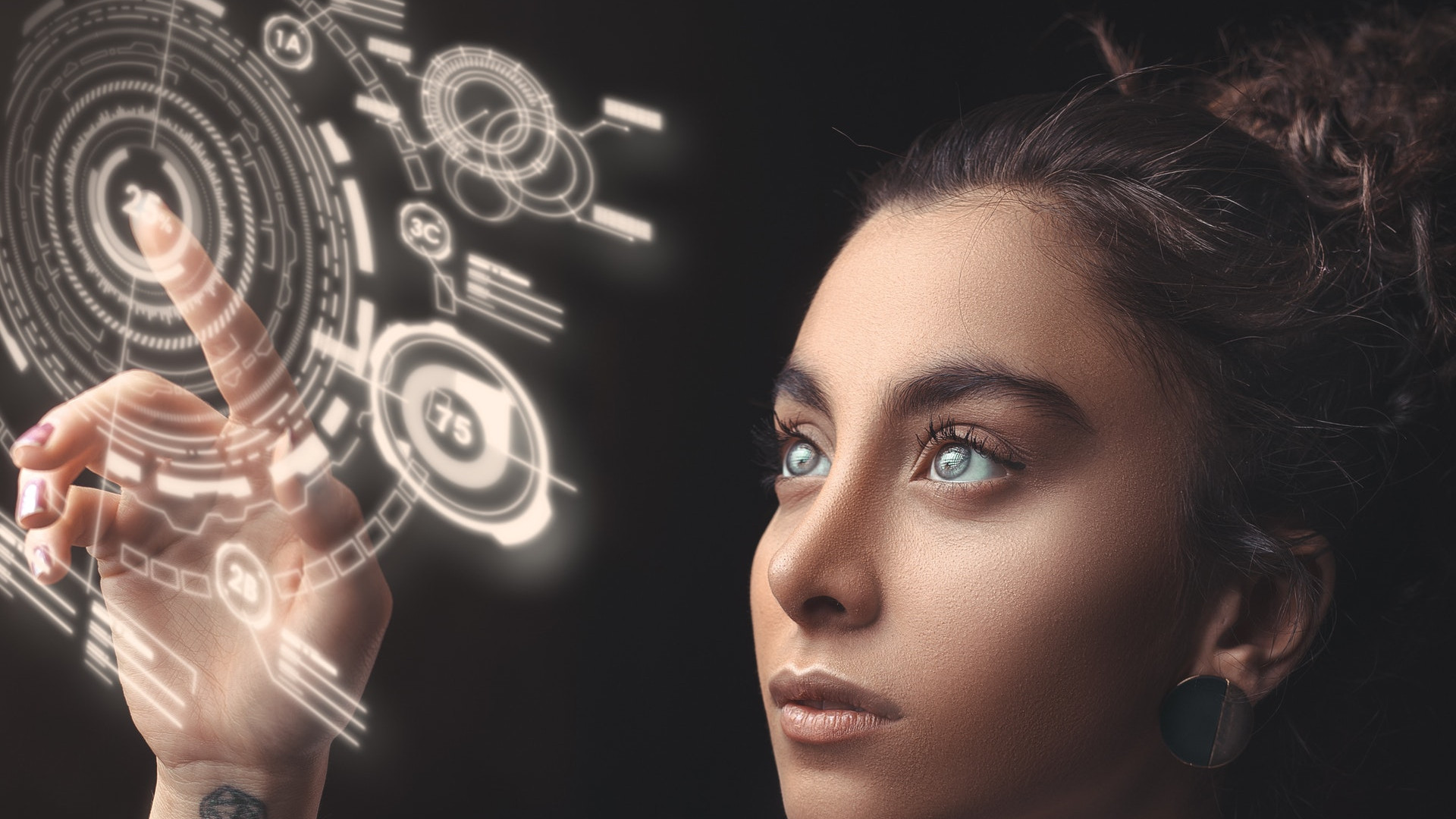
How AI will change the design industry
Artificial Intelligence (AI) has the potential to revolutionize the design industry, making designers more efficient and giving them new capabilities. However, AI is still mostly unknown to many designers, and figuring out exactly how it will work in the design world is very much open for discussion. AI is a buzzword that is often used...
Is the plain-text Internet having a comeback?
Many pages on the internet have become unusable - often for reasons that are related to advertising. After all, running a web page costs money and ads bring money. However, there is a growing number of web pages that are pure plain-text. No images, no ads. Just plain-text. Plain Text Sports is one of these...
