TikTok is famous for it's addictive nature, especially with younger users. It uses a few design tricks to keep users engaged.
Onboarding - It starts with a Swipe
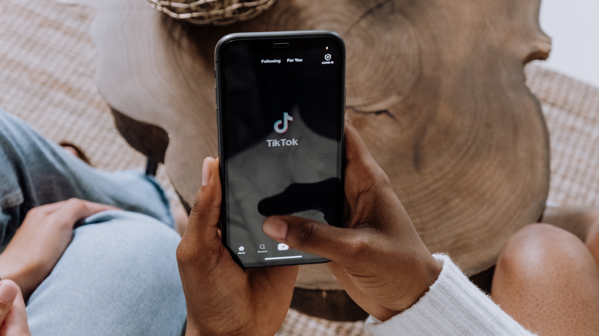
The process of getting hooked to TikTok starts right away in the users onboarding experience. TikTok asks users to choose their interests. This information is used for personalizing each user's feed. This is a common practice for products with curated content and used by many different apps.
But TikTok's user onboarding is really smart. It encourages users to scroll through the feed and tells them that the content will become more relevant and personalized the more they use it. While this is true for many algorithms, many apps don't tell users this explicitly. By doing so, TikTok encourages users to continue using the app for a better experience.
There's more. The swipe is the key element of TikTok's user interaction and one of its main sources of addiction. TikTok encourages you to swipe multiple times each time you use the app. The more you swipe, the higher the chances that you continue to swipe.
The clever trick is that after the first swipe you see new content. This triggers a chain reaction: every new sipe brings your new content. This habit forming process makes you using the app without thinking. Here, a distraction-free interface greatly increases the user engagement.
Focus on the content
TikTok's feed was quite unique when it came out. As a video and music network it has placed the user's content in the center of the experience. Instead of showing a variety of posts/videos, Tiktok's feed only shows one content item at once. They have also removed the buffer between posts so that there is no "skimming" on Tiktok. These changes allow the user to concentrate on one content at once and, more importantly, not miss out on relevant content due to "speed scrolling".
Many people have compared this interaction process to playing slot machines. It shows one post at a given time. It is the user's input that triggers an automated cycle in which more content is displayed on your screen. This is a classic method to hook the user for a longer engagement.
Tiktok's unique UI is a major reason why every app seems like it is copying it (but this UI is a popular layout among many Chinese apps).
All of the main actions and post info layouts are located in the same place at all times. Their sticky full-screen feed makes this possible, but it also eliminates the need to target different points as you scroll.
The main actions (Follow and Like, Comment, Share, Comment, and Share) are located in the most convenient position for thumb reach. To ensure they don't blend in with the video's content, these actions are also used large filled icons.
Many apps try to replicate this design but they overlook key reasons it was created. Snapchat's "Spotlight" section uses sidebars, but places them at the bottom of the feed for a "visual stack". This makes it more difficult to use your finger than the top, which is easier to use. Tiktok follows a similar approach, but elevates follow, like, and comment actions above all others, making sure that those three options remain at the top.
Why are the videos so addictive?
TikTok videos have three main reasons why they are more addictive than any other social media platforms:
Length: The average video is 16 seconds which is 9x shorter than Facebook's average.
Videos automatically snap into position: No "aim" is required, no zooming: a simple flick of your finger is enough.
Surprising: Videos are funny, interesting or weird. But always you get something personal.
TikTok's combination of low cognitive task and high variation makes it a classic example of an "addiction-forming" design.
In addition to that, many popular videos on TikTok have these characteristics in common:
- Simple (basic and very short)
- Unexpected (fills your curiosity gap).
- Concrete (e.g., how-to bake a cake)
- Emotional (fun/fear or music-driven)
- Story (e.g., woman looking for a book)
The takeaway
TikTok uses clever tricks to keep users engaged. From an ethical point of view, this is certainly questionable, because the app manipulates user behavior. From a business point of view, it's a perfect example for a very good product. For your business, you can certainly use some of the tricks to make your app more engaging. Get in touch with us and learn how your app can benefit from these tactics.
TikTok’s secret algorithm is its greatest strength – and could also be its undoing
Sources:
INTERACTION DESIGN
Design your products
Our technical know-how allows us to design products that not only thrive on technological sophistication, but also on the sensitivity for the people who use them.